
This post describes an autofocus test chart I’ve developed, why I think it’s better than others I’ve seen, and how to use it to test the autofocus of your camera and lens:
- Introduction
- What Makes a Good Test Chart
- How to Print It (downloading offered here)
- Preparing to Use It
- Taking the Shot
- Interpreting the Results
1. Introduction
If you suspect that your modern SLR or SLR lens has autofocus problems, you can use a chart like the one offered on this page to perform some tests.
The basic premise of a chart like this is that when photographed at an angle, the paper slices through the plane of focus. Depending on the situation, that plane can be very thick, encompassing the whole chart (leaving the whole chart in focus), or, more usefully, it can be very thin, leaving only the areas of the chart that intersect with that thin region in focus.
The illustration below shows proper autofocus and the result one might expect from it, where the region of what is actually in focus is more or less centered on the focus target. It also has views for the problems of back focus and front focus, where for some reason, the lens actually focuses on a region either behind or in front of the focus point (resulting in the in-focus area on the chart to be above or below the focus target). Mouseover the buttons under the chart to see those views.
 Back Focus – Proper Focus – Front Focusmouseover a button to see that view |
 |
It has to be said….
It must be said on a page like this that while there is certainly broken or miscalibrated equipment out there, it’s probably safe to say that the majority of “is my autofocus broken?” concerns are rooted not in miscalibrated equipment, but in the user’s misunderstanding of the equipment, or of proper technique.
If you suspect you have equipment with autofocus problems and mention it on a photography forum, such as those at Phil Askey’s most excellent Digital Photography Review, be prepared for three types of responses: “me too”, “are you sure?”, and “it’s all your fault.”
About that last group, sadly, some people seem to enjoy being combative and ignore all evidence that the user actually does understand the issues at hand, and persistently, incessantly post “it’s all your fault – you don’t understand anything” type responses. Just ignore them.
However, the “are you sure, did you consider…” responses tend to be from respectable forum members trying to help. Even if it does turn out that your equipment is at fault, you can always pick up good hints and tips from these people, so embrace and appreciate them. I certainly learned a lot when I went through this with my own autofocus problems. It turns out that the major cause of my problems was broken equipment, but in trying to understand where the problem lay, I learned a lotand improved my technique.
Oh, and I came up with an excellent autofocus test chart….
")
What You See What the Autofocus Sees
mouseover a button to see that image
2. What Makes a Good Test Chart?
Many factors make an autofocus test chart good or bad, but the two most overwhelmingly important are:
- the ability to ensure that the autofocus locks on to the exact location you intend, and
- that it allows you to clearly interpret relative crispness of focus across the scene.
Without the first, the test has absolutely no meaning, and without the second, you can’t grasp the meaning it holds.
Two popular autofocus test charts I’ve seen and used (and learned much from), by Tim Jackson (no longer online) and Leon Goodman, don’t address either of these concerns as well as they could, which is why I developed the chart presented here.
—————————————————–
Update (December 2008) — If you’d like to do serious focus-related lens calibration, also consider the LensAlign Focus Calibration System from the RawWorkflow.com, the makers of the WhiBal.
I consulted with them on the product during its design (“consulted” in the “had discussions and lent my expertise and opinions” sense, not the “got paid for my time” sense, though they did kindly give me one), and believe it’s a fantastic tool for lens testing and calibration.
It’s better than my chart in every metric… except price. 🙂
—————————————————–
I’ll go ahead and add a third important characteristic of a good test chart – perhaps the most important – proper instructions, because it’s easy to draw the wrong conclusions from an improperly used chart. The two charts I link to in the previous paragraph excel in this area, and reading through them is highly recommended.
Ensuring Autofocus Lock
Toward the first goal, the middle my test chart has a high-contrast black bar – the autofocus target – surrounded on all sides by liberal expanses of low-contrast gray that the camera autofocus can not lock on to. For an illustration of this, see the “What the Autofocus Sees” button in the super-shrunk view of the chart, at right.
(Testing to ensure that your camera’s autofocus system can indeed not lock onto the low-contrast gray is an important step in Preparing to Use the chart.)
Below is a small section of the chart at full resolution, from slightly left of center, showing part of the black bar that is the focus target (with the red line added here just to indicate the vertical centerline of the chart).

However, here’s what the autofocus sees:

This provides a clear target for the autofocus. The low-contrast gray extends quite a bit from side to side, but more importantly, it extends the full height of the page. This means that even when the chart is viewed at a steep angle like that shown in the photo at the top of this page, a large area of low-contrast gray still presents itself around the target, buffering it from anything else that the autofocus might lock on. Thus, with the precautions discussed later, you’re sure that the autofocus locks onto the target bar if it locks onto anything at all.
Ease of Interpretation
Toward the second important feature – allowing you to interpret relative focus – I’ve filled the area around the target with lines and boxes that, when viewed at an angle, make it quite clear how focus progresses as you inspect up and down the page:

It should be readily apparent how useful the lines and blocks are when viewed this way, but it’s perhaps useful to contrast this with a different method I’ve seen.
I’ve seen autofocus test charts that use lines of random Lorem Ipsum text, because, as the author correctly notes, we are hypersensitive to the crispness of text, so it makes for good test fodder. The problem with this approach is that we don’t really care about absolute crispness, but want to scan up and down to gauge relative crispness. For this, random lines of spaced text are not as good because there’s no continuity as you scan vertically.
On the other hand, this chart’s vertical lines make for something that would be smooth and consistent throughout a verticalscan if focus were perfect throughout, but since focus is not perfect throughout, the smooth and consistent nature of the lines highlight clearly what is and isn’t in focus.
Additionally, when some of the lines are dashed, the individual blocks making up the line become convenient visual markers of distance from the focus target, allowing you to quickly compare a block above the target with its counterpart the same distance below the target.
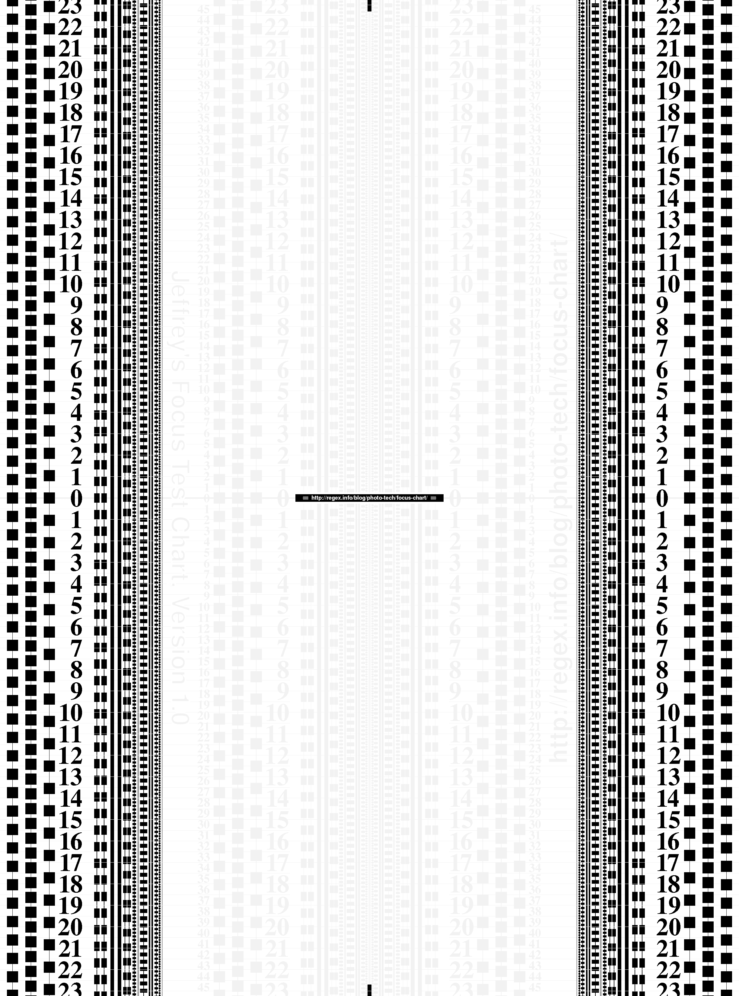
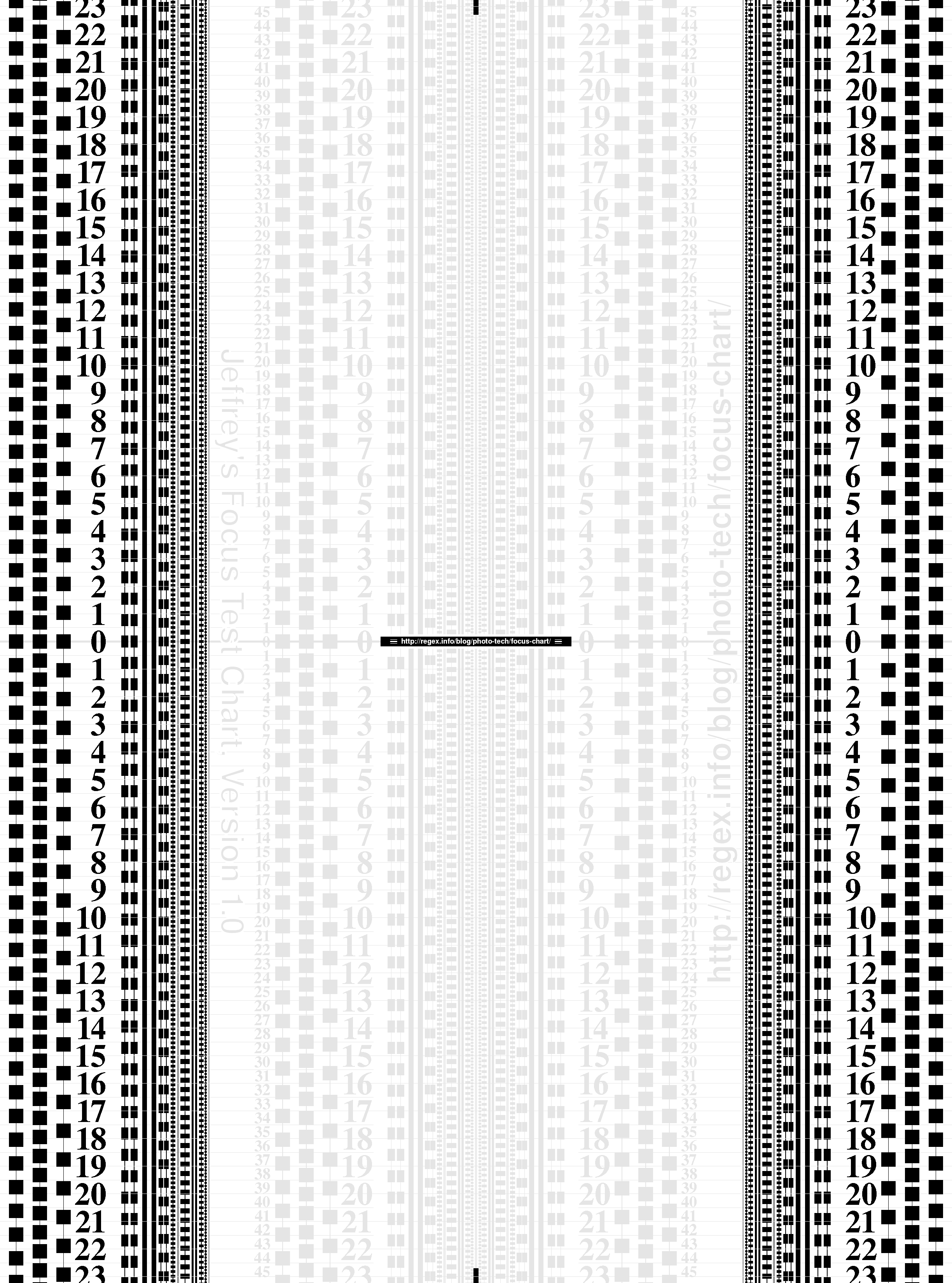
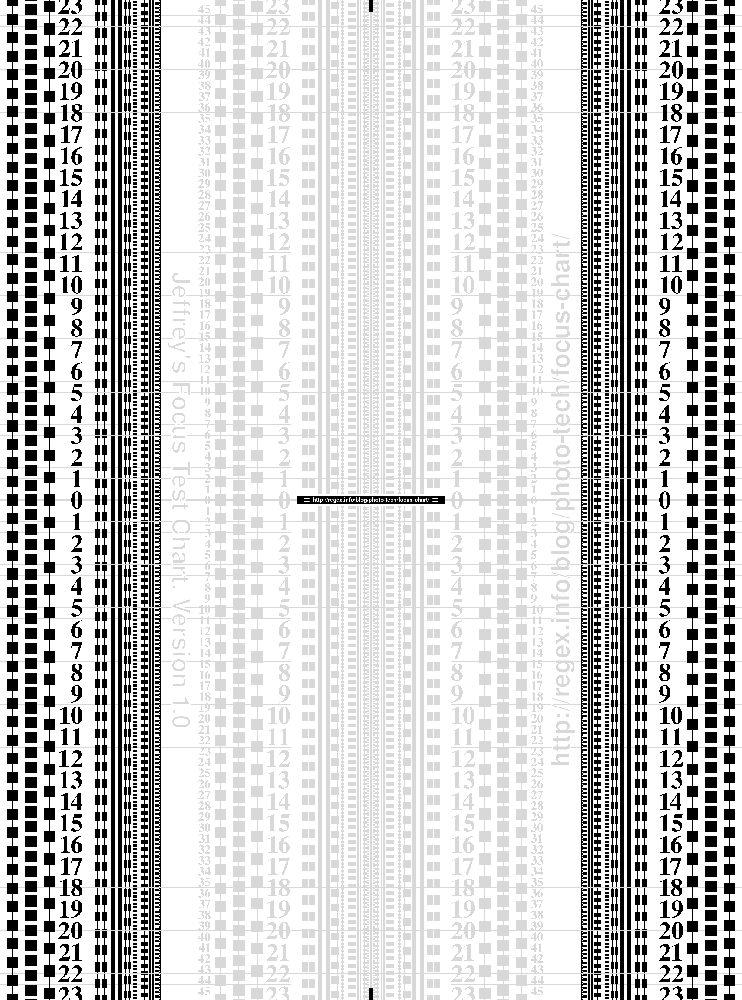
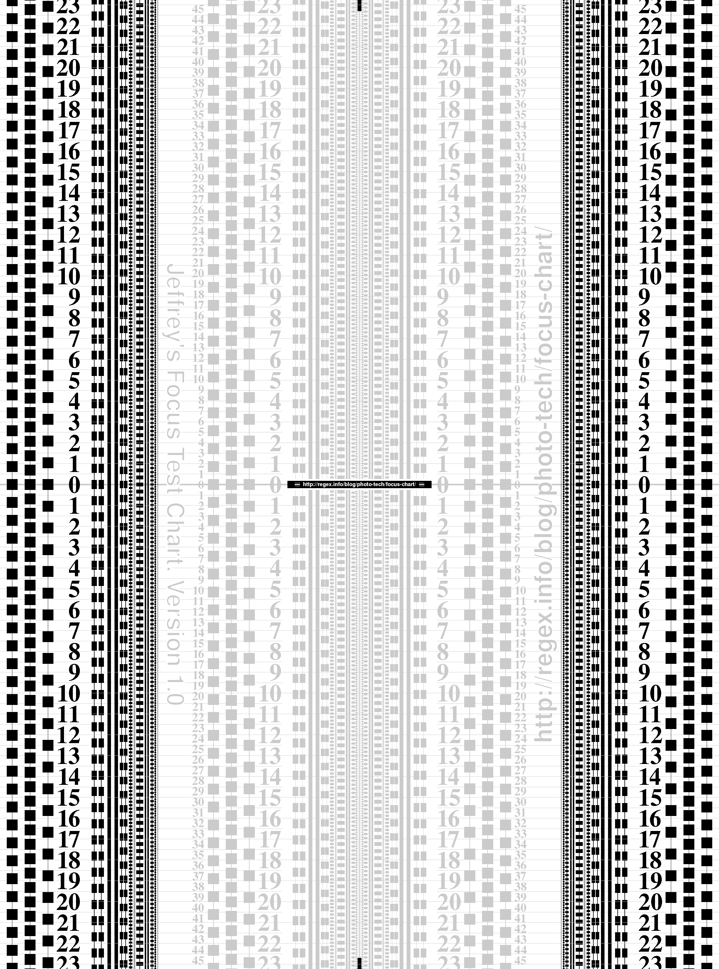
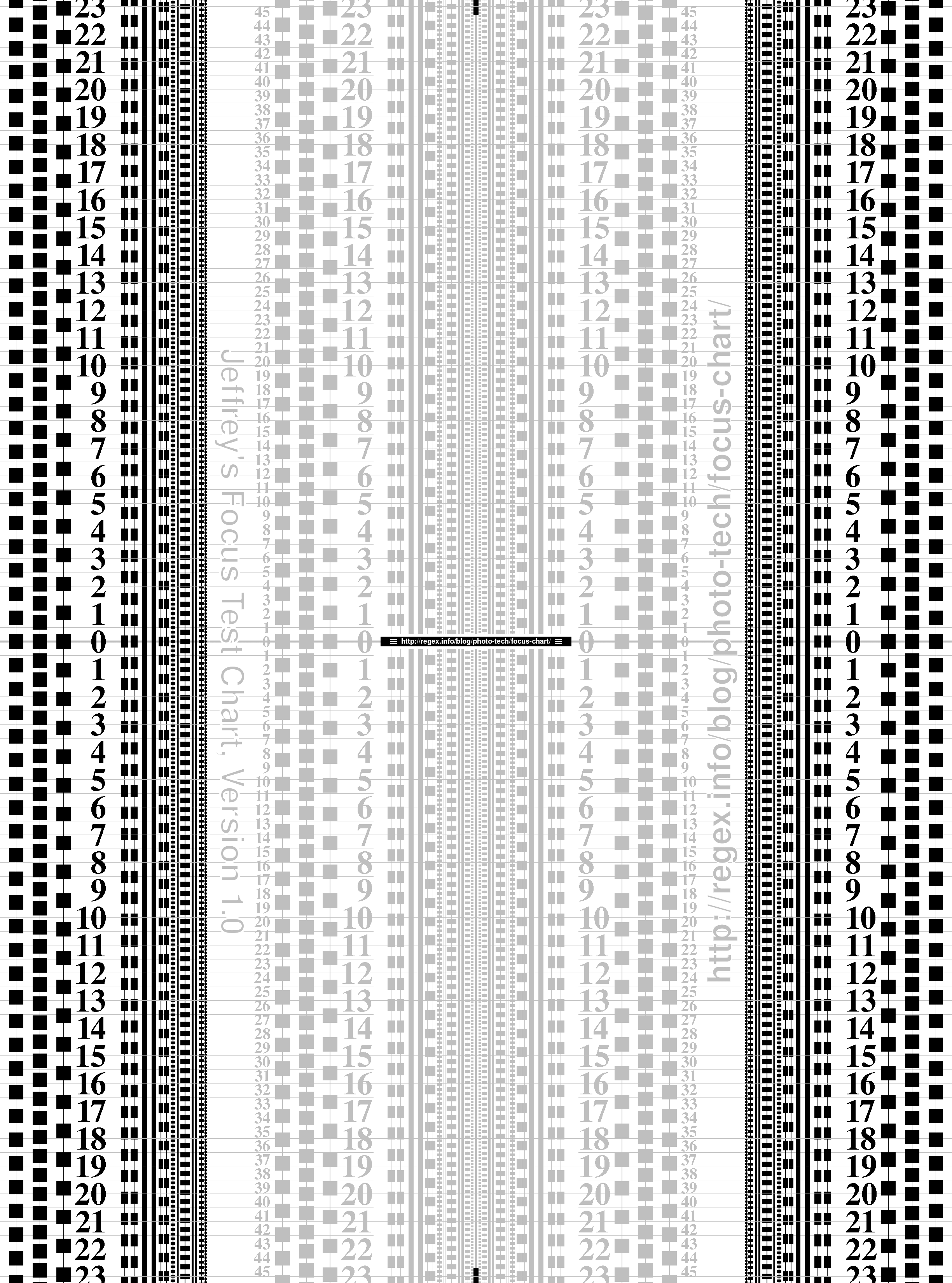
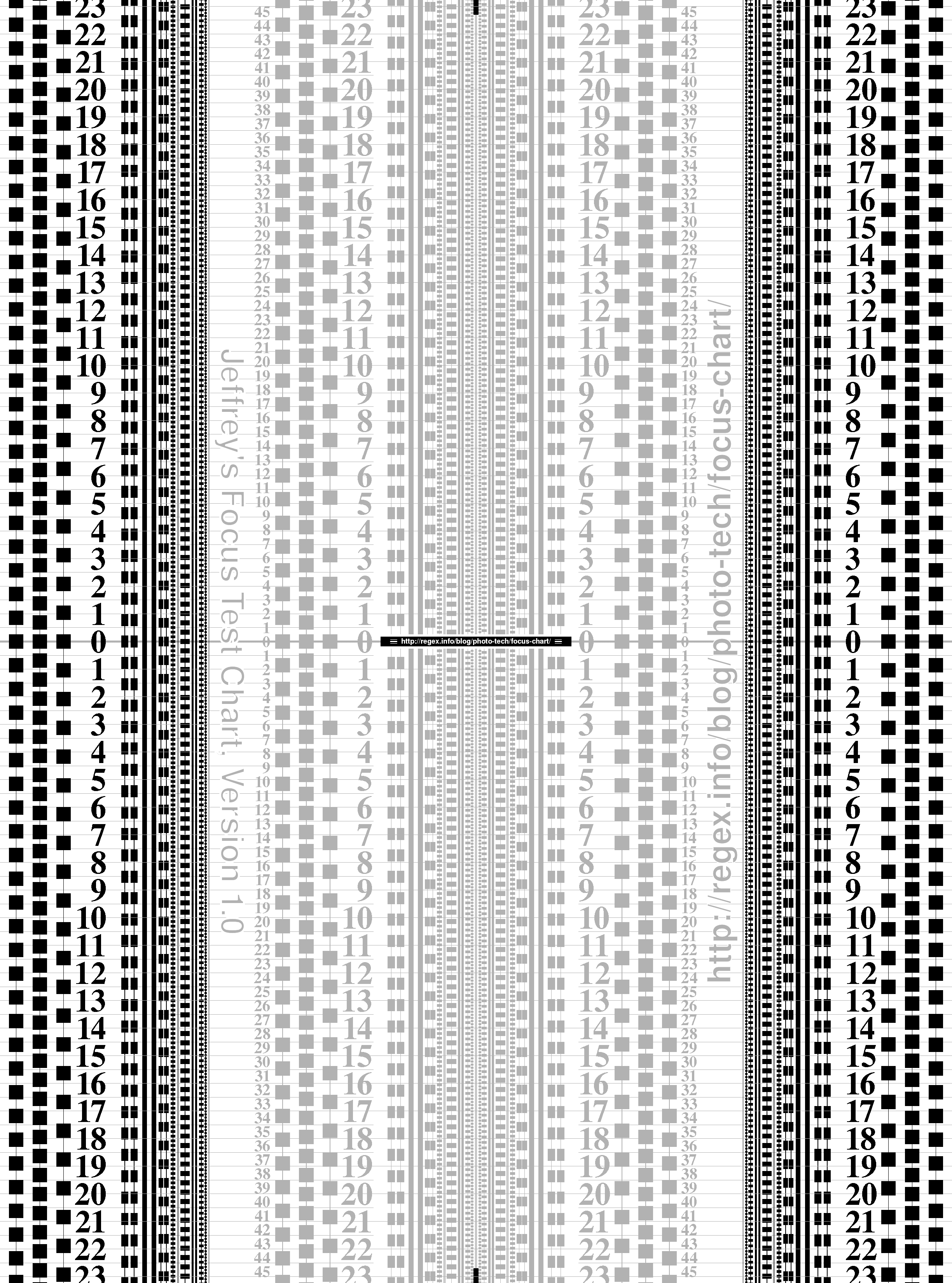
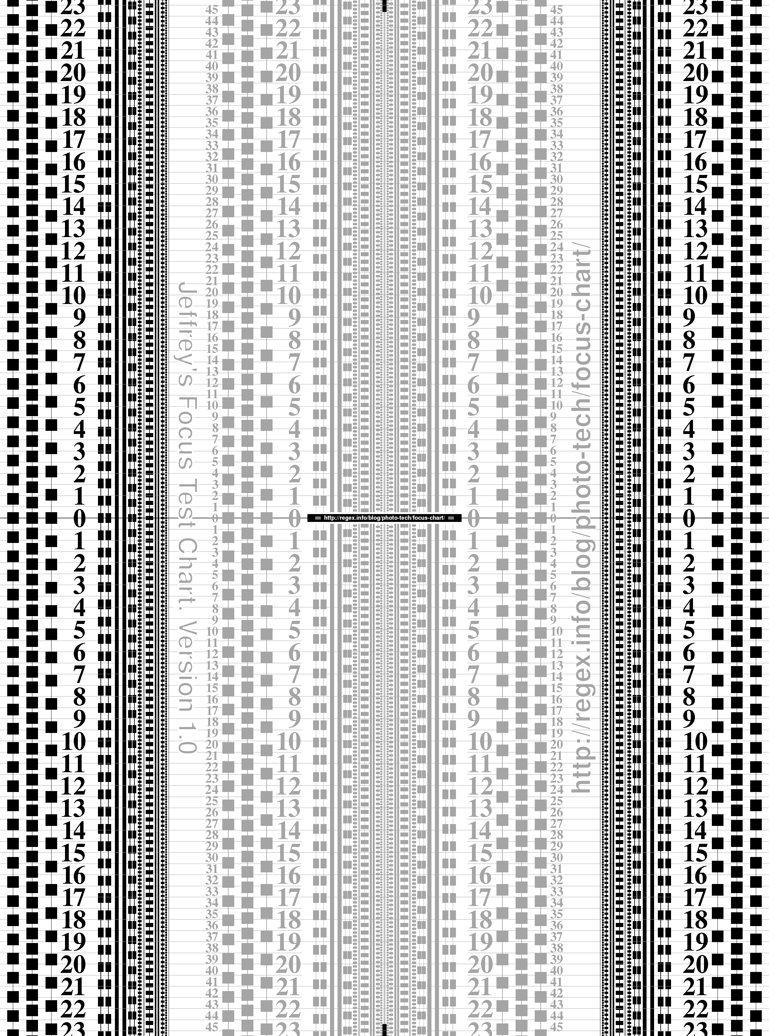
3. How to Print The Test Chart
The test charts are provided as 2,449 × 3,299 pixel grayscale GIFs, which, when printed at 300 ppi, fit nicely on US Letter or A4-sized paper.
The key to properly printing the test chart is to get a result in which the gray areas are faint enough that your camera’s autofocus system can’t lock onto them, but are distinct enough that you can use them to gauge the results. With my printer on my paper in the light I use for tests with my camera, “25% gray” seems to be the sweet spot.
Your situation may be different from mine, so I’ve built seven different versions of the test chart, each with differing levels of gray for the low-contrast areas. The 5% version is the most faint, while the 35% is the darkest:
| Download Jeffrey’s Autofocus Test Chart (version 1.0) |
| 5% · 10% · 15% · 20% · 25% · 30% · 35% |
| On Windows, right-click the desired link, and on a Mac, ctrl-click the link, then select the “Save Target As” or “Download Linked File” item to download the chart image. |
I’ll suggest that you start with the 25% version that worked for me, printing and testing as instructed below, returning to trya lower-contrast version if need be.

Be sure to print at “100%” without any “fit to paper” option so that the resulting print is as crisp as your printer can produce. Any resizing necessarily incurs fuzziness, which can make interpretation of the results slightly more difficult.
It makes sense to select the “center image on page” option, if your print dialog offers it. Depending on the printer, you may have to select borderless printing in order to fit the full image onto the page, or just as well, let a tad be cropped off. Either are better than resizing to fit the page.
If printing from within Photoshop, be sure to tell Photoshop that it’s to be printed at 300 ppi by selecting “Image > Image Size…” and unchecking the “Resample Image” box, then change the Resolution to 300, as shown at right.
If possible, print on high-resolution matte photo paper, such as Canon’s MP-101. Besides giving a crisper print, the paper is more sturdy, which makes it resistant to curling and warping (both of which are detrimental to its successful use in testing focus).
After printing, test the appropriateness of the low-contrast gray by lighting the chart well, filling the viewfinder with the gray area, and checking to see whether the autofocus can lock on to it. If it can, you need to move to a lower-percent gray.
The version you’ve printed holds promise if the autofocus system can’t lock onto the gray, but the quick test you’ve just done is only preliminary. Be sure to check again under actual conditions after setting up for the real shot, as described below.
4. Preparing to Use It
Using the test chart involves taking a picture of it, but it’s important that it’s done under the right conditions.
The Setup
- Bright — you want enough light for the autofocus system to do its job, and to allow for a fast enough shutter speed, to reduce overall shake-induced blur.
- Wide open aperture — the wider the aperture (that is, the lower the f-stop number), the more shallow the depth of field becomes, thereby accentuating any focus-related problems. Using aperture-priority exposure mode makes this easy to ensure.
- Autofocus On — lest you forget 🙂
- Fast Shutter — you want a fast enough shutter speed to eliminate the blurring effects of camera shake.As one suggestion, you should have enough light to get at least a 1/1,000th second exposure at ISO 400 or lower. (That should cover most bases, but if you’re skilled enough to think this page might be useful, you’re probably skilled enough to know what shutter speed you need to eliminate shake-induced blur.)You might also consider using a tripod, and a remote shutter release.
- IS? / VR? — I’ve never heard of an image-stabilization or vibration-reduction feature causing changes in focus accuracy, but just in case, if you have equipment with these features, it might make sense to test both with and without them.
- Low ISO — the ISO sensitivity is not particularly important in its own right, but it’s important to realize that while increasing it allows you to get more sensitivity from the sensor, but it does nothing for the autofocus system.If you know you have plenty of light for the autofocus system and merely want to push the shutter speed really high, increasing ISO is fine. Just realize that pushing it too high adds some level of noise-induced blur to the overall picture.Personally, I like to keep the ISO under 400 on my Nikon D200, but I’ll go to 800 if needed when doing a quick focus test that I’ll not put too much stock in.
- Square to the Chart — it makes interpretation easier if you’re exactly square to the bottom of the chart (that is, you’re aiming straight to the chart on the horizontal plane, without any side-to-side angle). The top-center and bottom-center of the chart has small black “sightlines” that can be of help.
- Chart is Flat — if the chart is not perfectly flat, its slight rumples can have a large impact on the focus. It’s okay if just the corners of the chart float a bit off the table. The focus is on the main part of the chart, so to speak, and that’s the section that must be perfectly flat.) Using a heavy-stock paper helps a lot.
- Exposure Compensation — especially in really bright light (e.g. direct sun), automatic exposure tends to underexpose the fairly uniform brightness of the chart, so you may need to dial in some compensation. A few sample shots should make it clear whether this is necessarily.
- Enough Distance — nothing will work if you’re closer than the minimum focus distance of the lens, so be sure that you’re far enough away that you’re not bumping up against that limit. Note that some lenses have a different minimum-focus-distance between manual focus and autofocus. Zoom lenses can have a different minimum depending upon the focal length in use.
Deciding how far away you should be from the chart is influenced by what kind of test you want (some lenses display autofocus accuracy that varies with subject distance), the focal length of the lens, and the nature of your autofocus sensors.
Understanding Your Autofocus Sensors
It’s possible that the active area of the camera’s autofocus sensor exactly matches the indicator you see in the viewfinder, but it’s not likely. More likely is that the active area of detection is a bit larger, perhaps asymmetrically so.
The photo sequences below illustrate the pitfalls of not understanding your camera’s autofocus sensors. The right-hand image is just a closeup of the central part of the full-frame left-hand image. Mouseover the four descriptions below the pictures to see the story unfold…
| Improperly Performed Test | |
 Full Frame |
") Closeup View |
|
|
The final result above appears as if the camera/lens has back focus, but in reality, it’s just picking an unexpected spot to focus on. It would be nice if the indicator in the viewfinder exactly matched the active area, but since that’s not the case, it behooves you to understand your sensors.
I should be clear that the illustration above is just to make a point, and it’s unlikely that any camera actually has an autofocus sensor shaped like that shown in steps 3 and 4.
I’ll leave the detailed description of mapping your autofocus sensors to the link in the previous paragraph, but in short, one way to measure the active area is to get close enough to the chart so that the low-contrast gray area fills the width of the viewfinder, and place the sensor indicator right in the middle of it. Having nothing high-contrast anywhere nearby, it shouldn’t be able to lock onto a focus, but instead, should hunt around until it gives up. (If it can lock onto the low-contrast gray areas, you’ll need to use one of the lower-percent gray versions offered in the How to Print It section.)
Then, as you move the aim toward the high-contrast black running up and down the sides of the chart, keep trying the autofocus, and once it’s able to lock on, note where the black begins relative to that edge of the sensor indicator. You can dothe same moving the other way, and up and down, and so “map” the true active area of your sensor.
If you have multiple sensors, they may well each have their own characteristics, so you may wish to map them all, but for the purposes of testing your autofocus system, it’s sufficient to use only the middle sensor.
Of course, the more you can fill the viewfinder with the chart, the better. Even if the scenario above results in a valid test, chart is too small to really make out much detail from it, even with the resolution my 10-megapixel SLR affords.
5. Taking the Shot
After taking into account everything in the previous section, it’s a simple matter to take some shots. Take multiple shots at different angles of attack. A lower angle shows the depth of the in-focus field the most clearly (and with it, the accuracy of the autofocus system), but requires the most care to ensure that the autofocus sensor does not see the top of the chart instead of the intended target.
(There’s an example of a valid test with very low angle of attack in the next section.)
While shooting, keep the following in mind:
- Keep double-checking that you’re square to the chart
- Be very careful not to allow yourself to move the camera between achieving focus lock and actually taking the picture. Some people, for example, have an unconscious habit to move forward a half an inch in the process of taking the shot, and such movement would absolutely destroy any meaning to this test.
- If you’re near the minimum-focus distance of the lens, keep that in mind as well.
- Pause occasionally to double-check that the autofocus can’t lock on the low-contrast gray (by pointing at the wide expanse of it in the upper half of the chart and confirming that focus can’t be found.)
Once I’ve set up for a particular shot, I take it, then point the camera at something far and autofocus there, then return to autofocus on the chart, taking a second shot. I then do the same with something near (if I’m not already near the minimum-focus distance of the lens) and return for a third shot. This way, I feel sure that the autofocus is starting from scratch each time.
I got used to taking multiple shots set up the same way because my lens was giving somewhat random results. I guessthat’s one symptom of being broken, because after it was fixed, the results were consistently spot on.
6. Interpreting the Results
After taking the shots, I load them into Adobe Lightroom and make a couple of quick adjustments to make the results a biteasier to see (I convert them to grayscale, and adjust the contrast a bit to accentuate the low-contrast region). Lightroom is excellent for this because it lets me quickly zoom and pan on an image (more quickly even than Photoshop), and to quickly flip back and forth among multiple images.
In interpreting the results, I look at both the vertical progression of the lines, and the numbers that run up and down the sides. Consider this example:

Nikon D200 + Nikkor 17-55 f/2.8 @ 55mm — 1/3000 sec, f/2.8, ISO 100 — full exif
The Clear Area is Clearly Clear
The depth of field here is only about 8 millimeters (a third of an inch), so it’s fairly easy to see the effects on the chart as it slices through the in-focus region. The more clearly focused parts of the vertical lines seem to be properly centered on the target stripe, and comparable numbers (e.g. the left-side “2” above the midline and the left-side “2” below the midline) seem to be about equally fuzzy.
Actually, in this case, there might be the slightest bit more sharpness to the numbers above the midline, but it’s so slight that it could well be because the autofocus picked the top edge of the target stripe rather than the bottom edge. That’s how good the autofocus was with this shot.
(Frankly, it could be that the bottom sets of numbers have the slight edge in sharpness…. the more I stare, the fuzziereverything becomes!)
Let’s look at another example…

Nikon D200 + Nikkor 17-55 f/2.8 @ 17mm — 1/6000 sec, f/2.8, ISO 100 — full exif
A Low Angle of Attack
Here, the depth of field is almost 10 times larger (7.6 centimeters; 3 inches), which makes it more difficult to draw conclusions from the vertical lines. In this case, I focus more on the numbers (haha, I’m so witty). Clicking through to thelarger version and comparing the two “5” above with the two “5” below, they feel fairly close in their fuzziness, although the upper pair are a bit sharper. In this case, that’s to be expected because we’re close enough to the chart that the depth of field is not evenly distributed in front of and behind the focus point: about 3.5 centimeters are in front, and 4.1 behind.
Depth of Field Measurements
Pedantically speaking, “Depth of Field” doesn’t really refer to the region that’s “in focus”, but rather, “of acceptable focus.” The difference reflects the fact that as you move in front or behind the focus point, the focus starts tapering off immediately, and continues to do so indefinitely. What’s considered “acceptable focus” changes depending on the intended use and the resolution of the medium capturing the image (that means, among other things, that the depth-of-field calculations are camera dependent). The current Wikipedia page on Depth of Field has a good presentation of the concepts.
My Online Exif Viewer reports on the depth of field if the image data contains all the requisite data required to compute it. Some of this data is in the Maker Notes section of metadata, which Photoshop strips, so for best results, check with an original straight-out-of-the-camera image.
A Few More Samples
Here are a few more samples to inspect. As with most images on this post (and on my blog, for that matter), clicking through on the image brings you to a larger version.

At first glance this one might appear to be okay because the target is clearly focused, but comparing, for example, the lower-left “4” with the upper-left “4”, shows that there’s a bit of back focus here.
This was taken with a 200mm lens from a medium-close distance (about three yards), which results in a depth of field evenly split on either side of the focus point. Had it been taken with a short focal length at a close distance, it’s possible that the depth of field would start to skew more toward the rear, and as such, a result like this might be expected. That’s not the case here, so this shows back focus.

Some pretty severe front focus

Front focus

Severe back focus
7. Conclusion
I would expect that the only people who actually read this far are those suffering from really bad autofocus problems, and are desperate to understand them. You have my sympathy, and I hope that my test chart and what I’ve so verbosely presented here are helpful.
Theo: http://regex.info/blog/photo-tech/focus-chart
